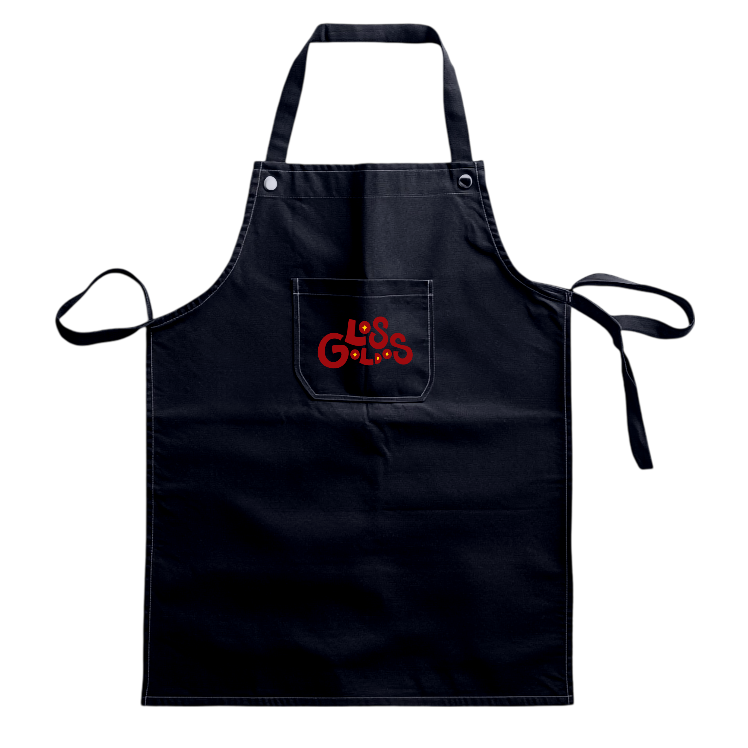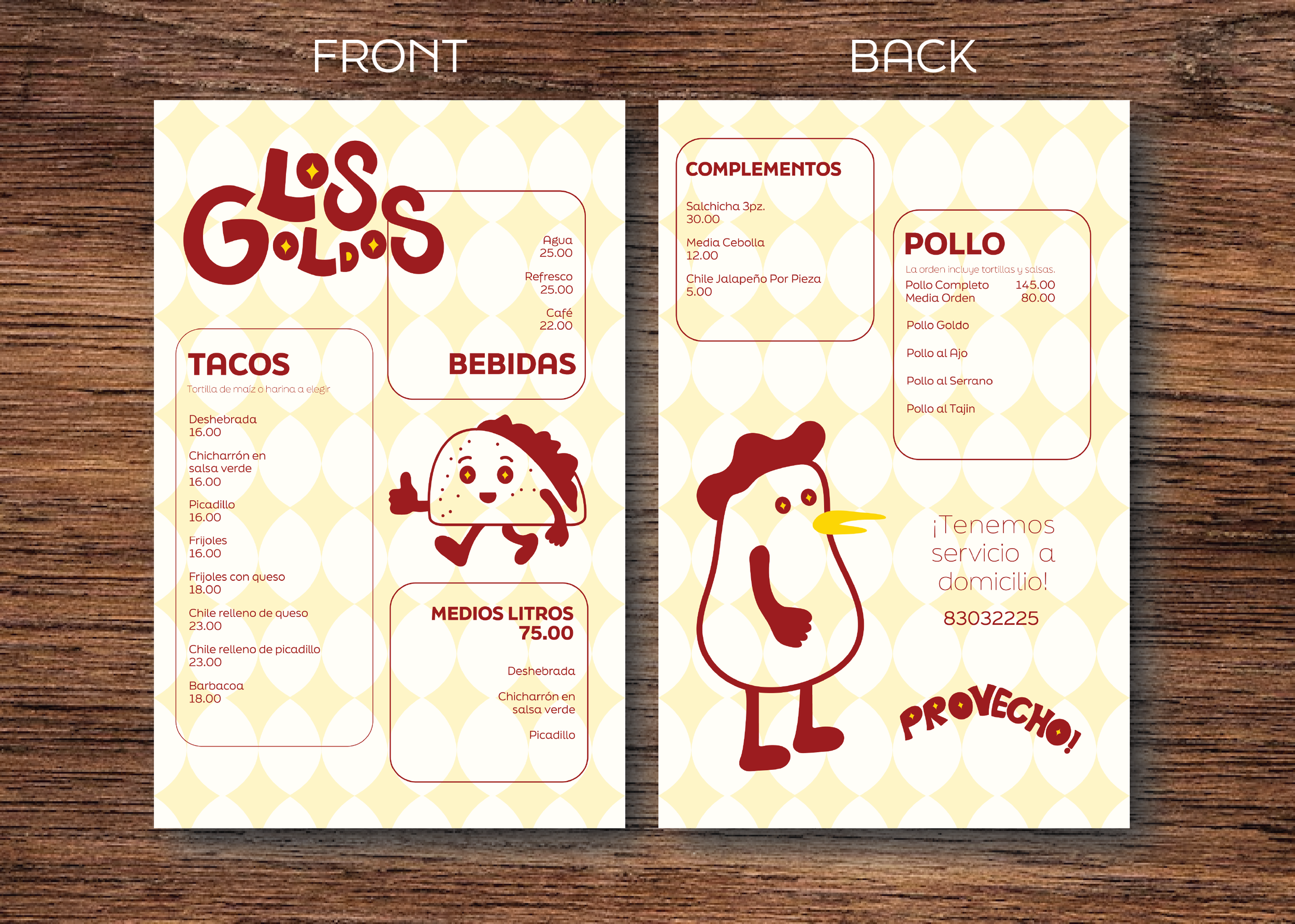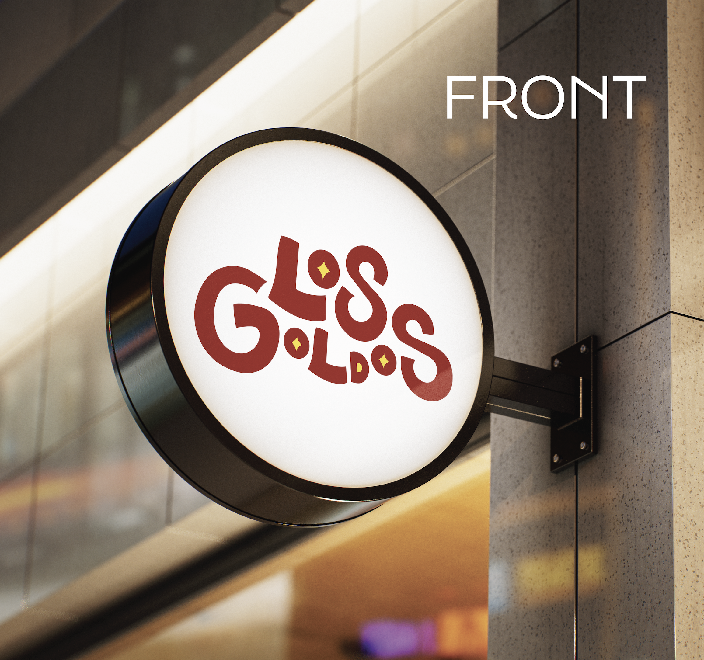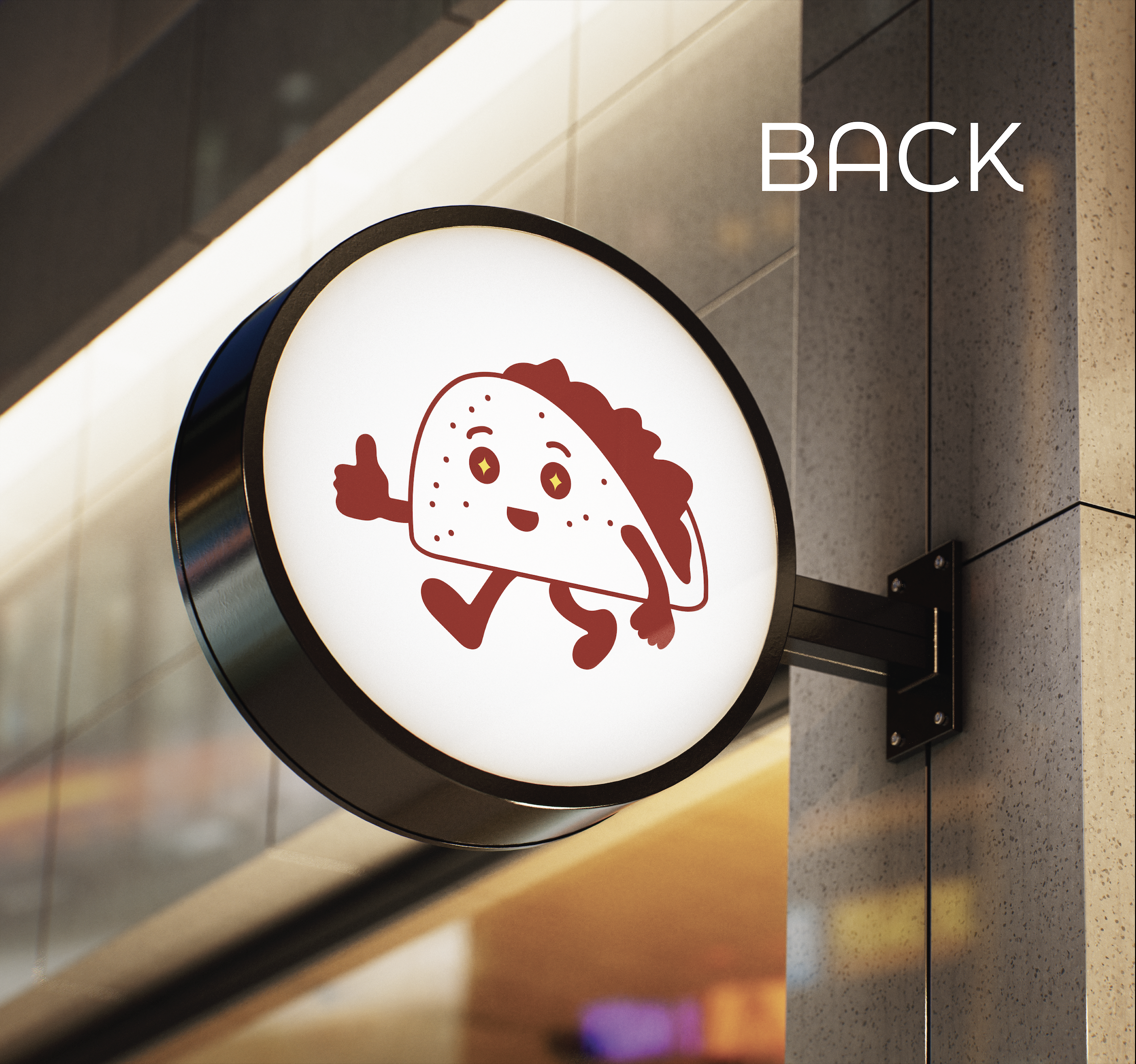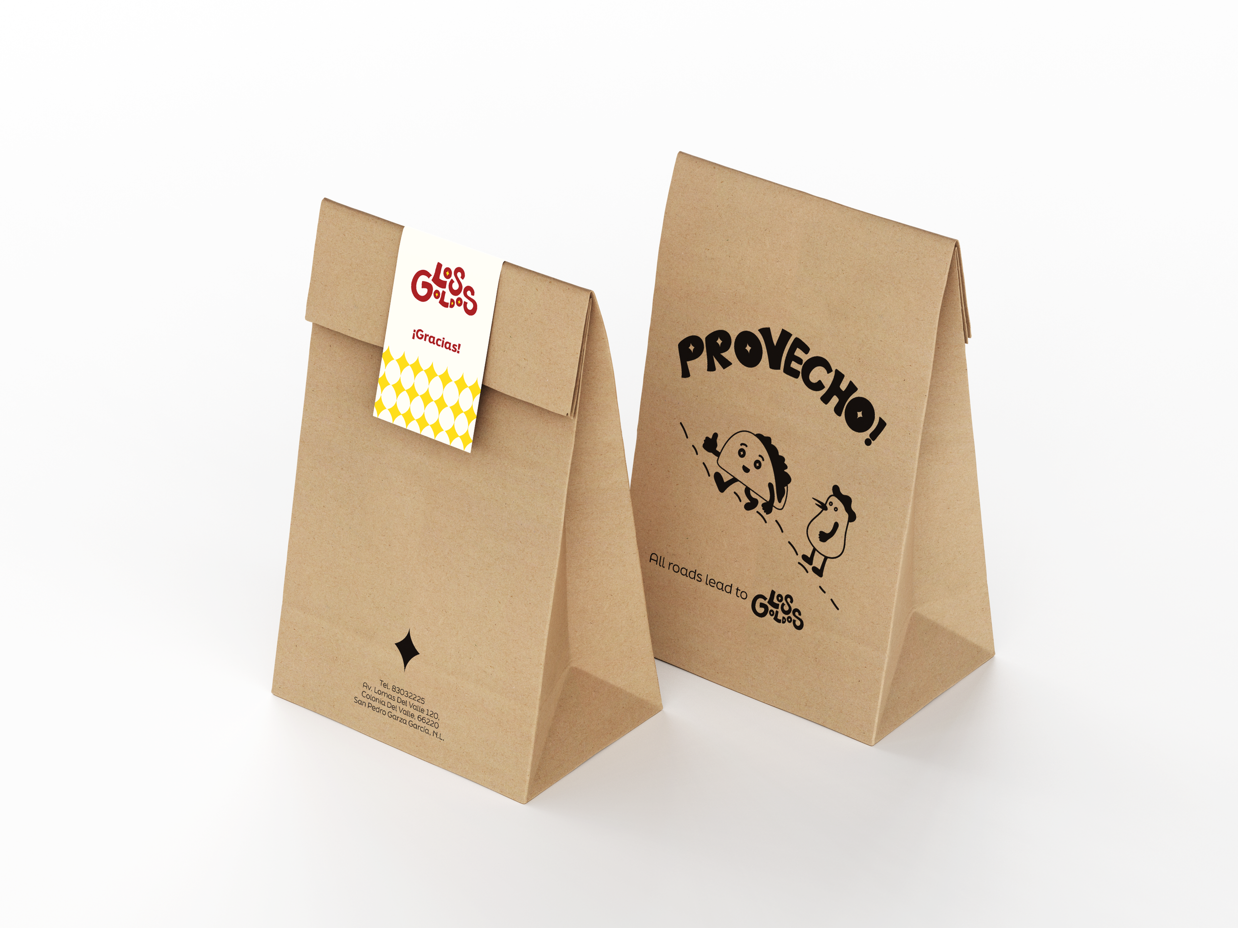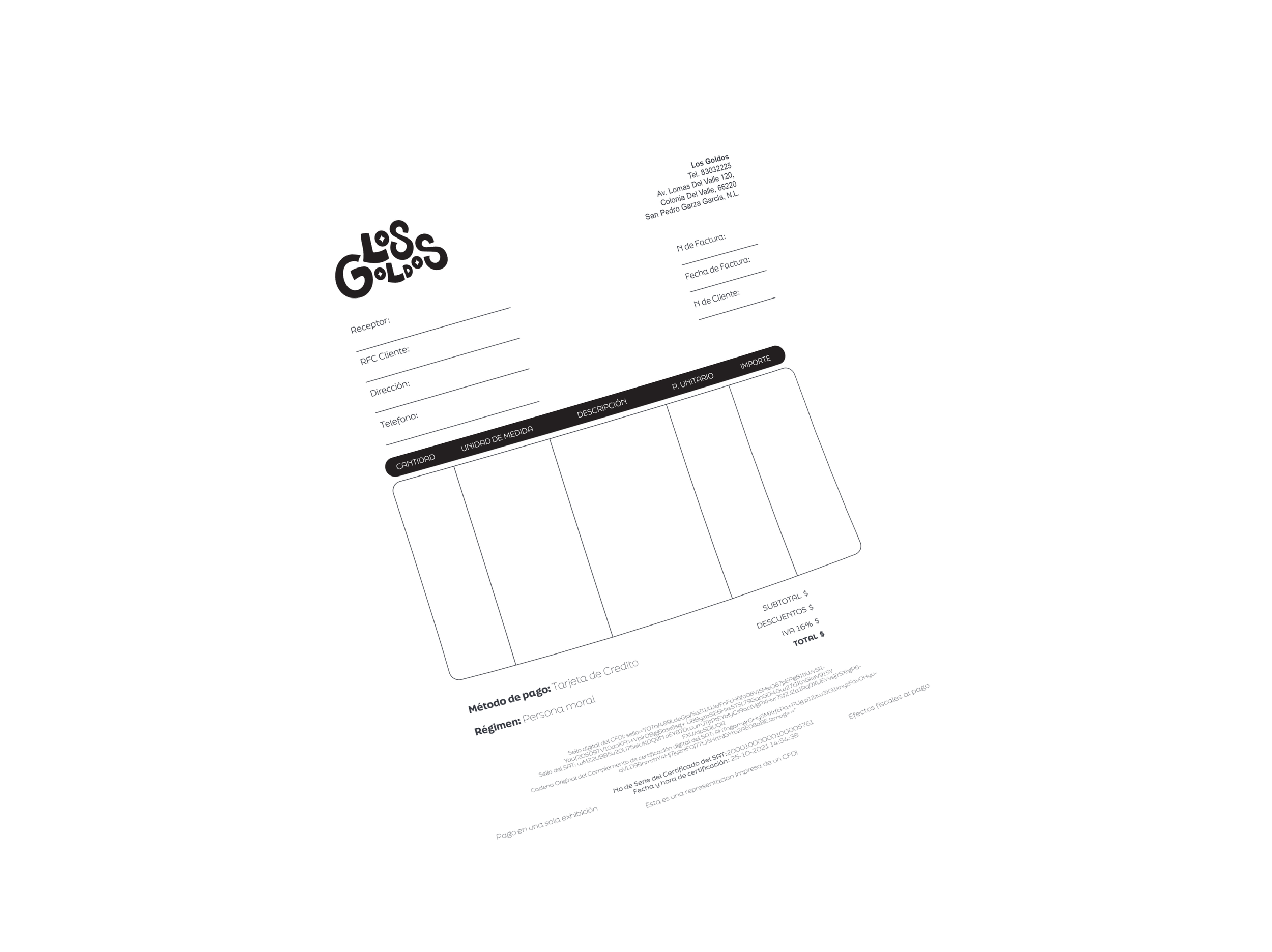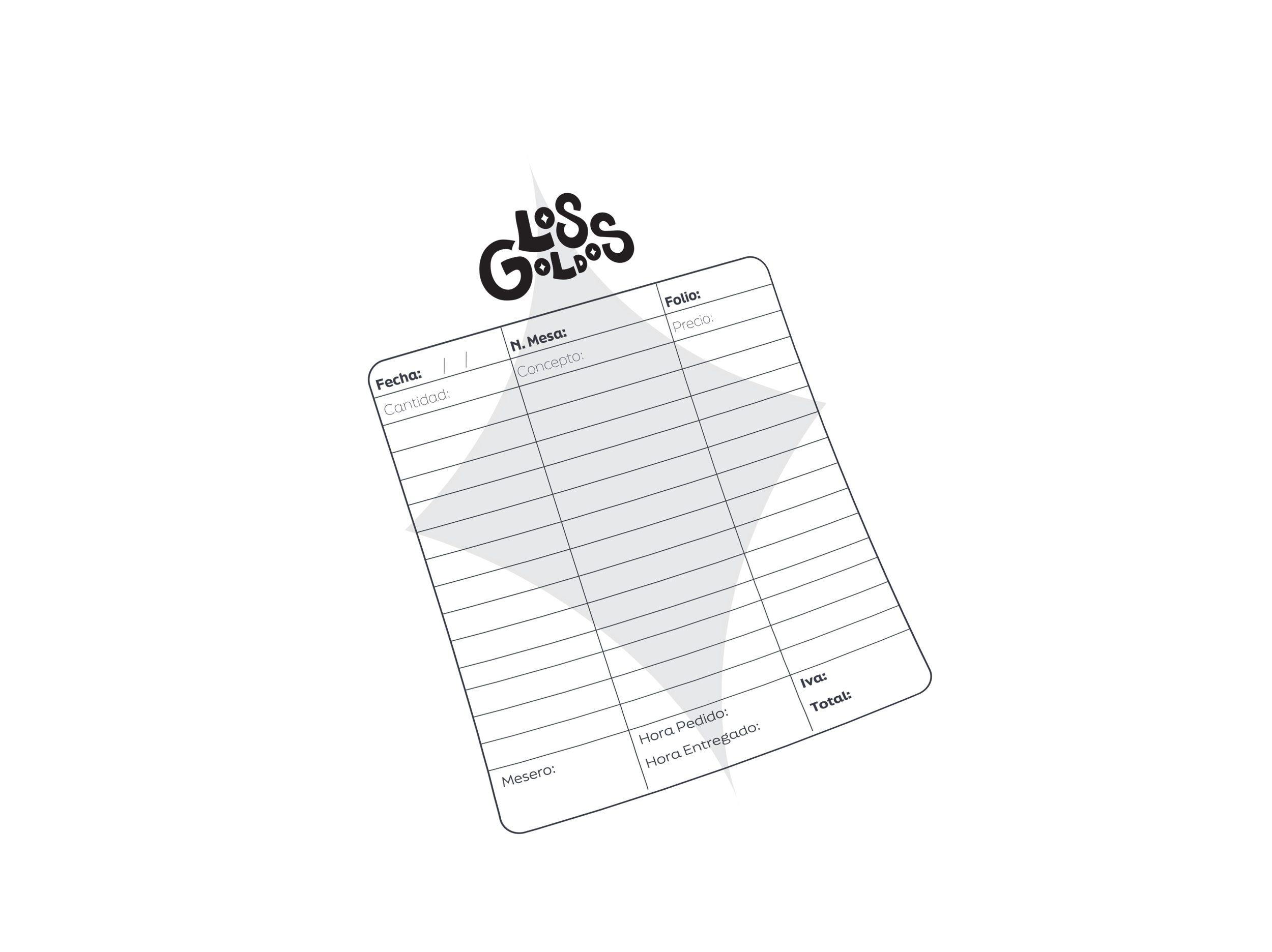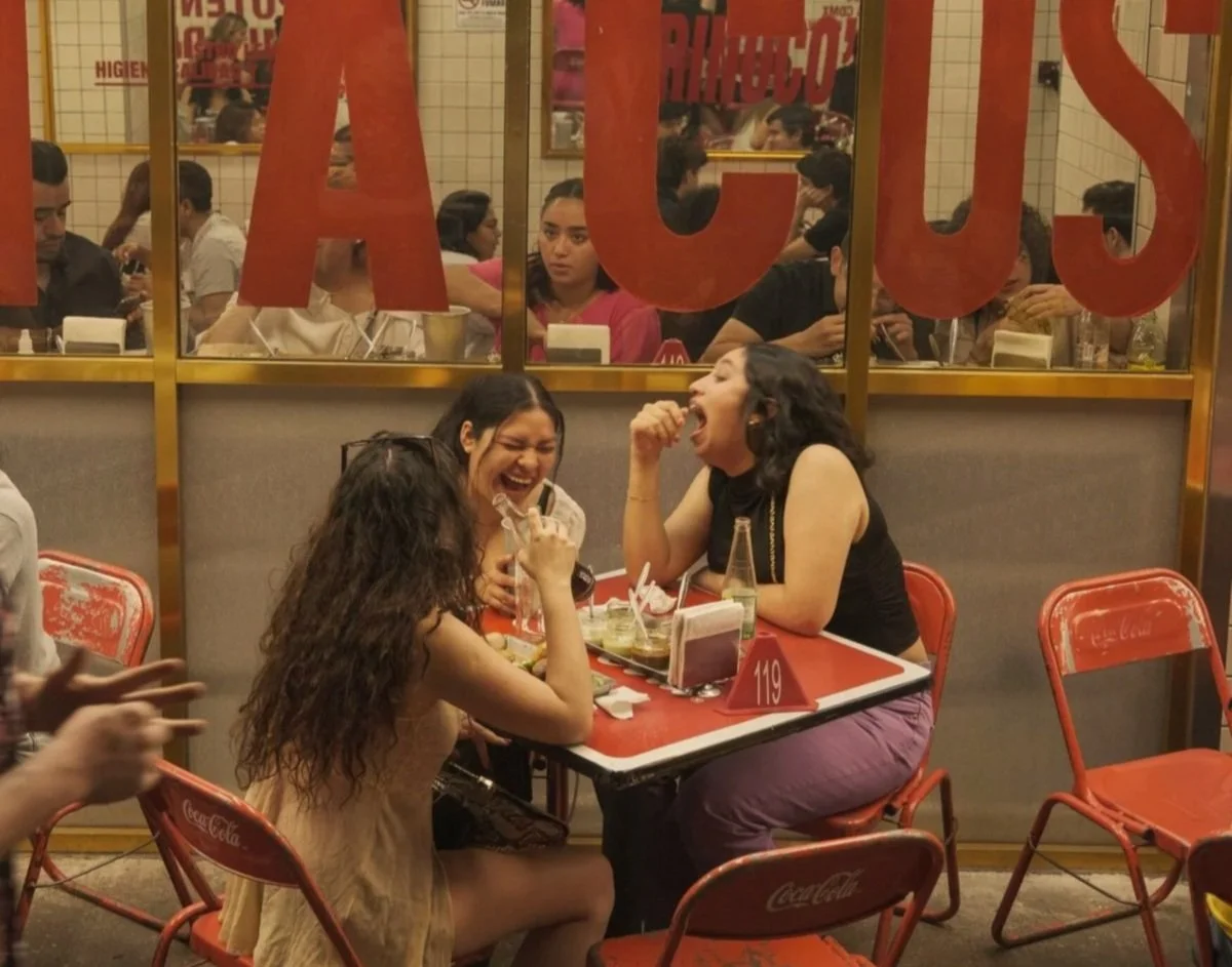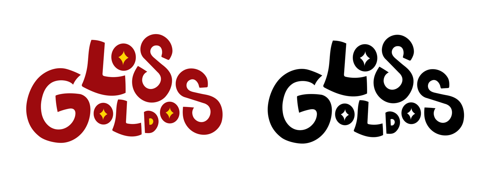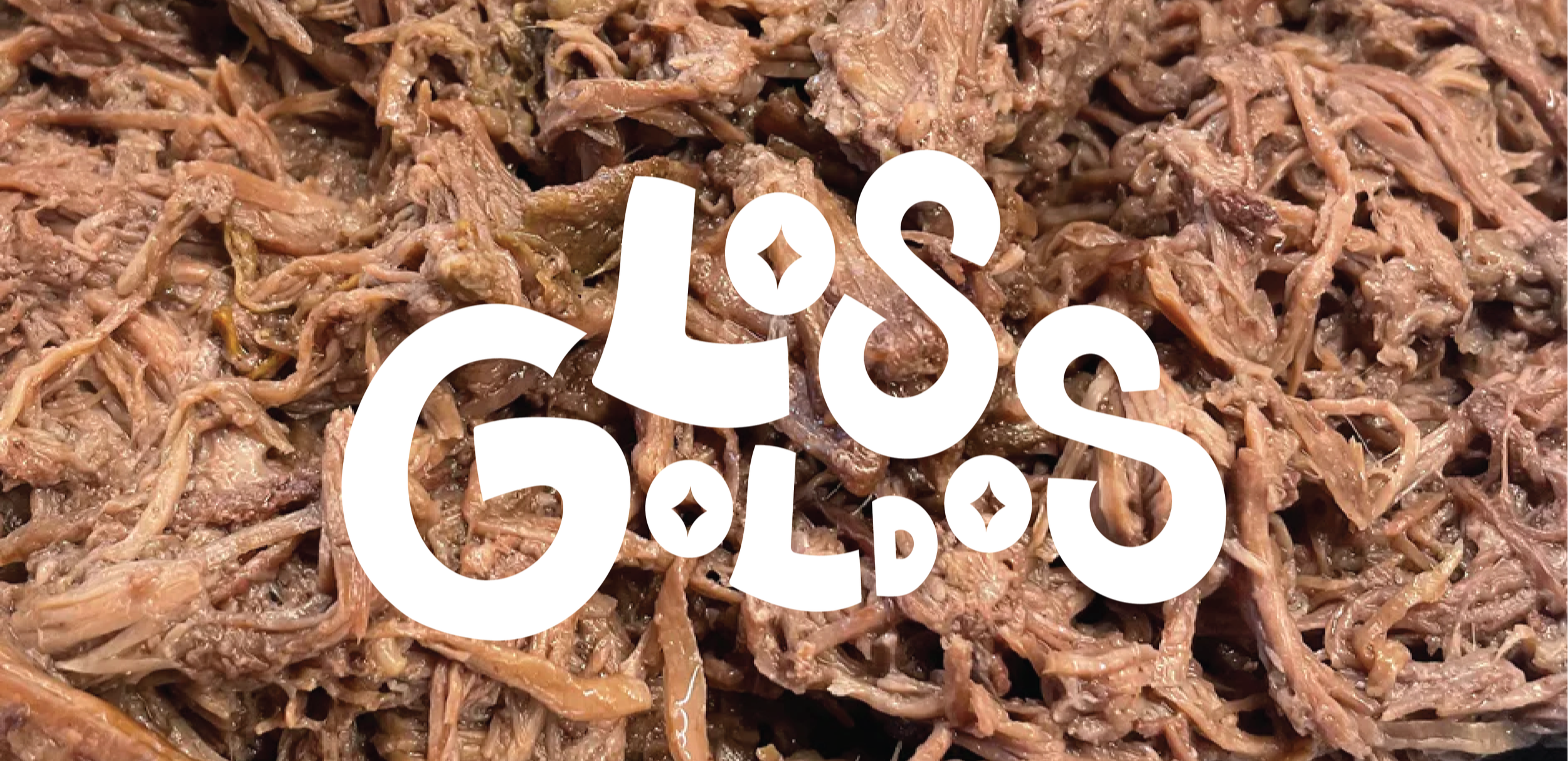
Los Goldos
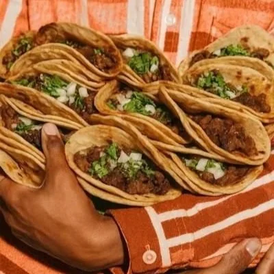
Developed a complete brand identity system for Los Goldos, a taco and chicken restaurant in Monterrey, focused on creating a visually distinctive presence within a highly saturated food industry market. The final solution came to life always staying focused in the owners and the meaning behind the business to make it feel authentic.
Created surrounding a playful retro-inspired vibe, character illustrations and bold visual elements to increase memorability all to make it feel vibrant and cohesive.